CORRECTIONS AND UPDATE: In checking our methodology (prompted by Laurence Chandy, to whom thanks), we realize that we underestimated the impact of the new PPP lines on poverty due to two mistakes in the computer code underlying the original version of this post: we used 2010 CPI figures where we meant to use 2011, and conversely, we used 2011 population figures where we meant to use 2010. An explanation of the error and the changed numbers are presented below, along with access to the original estimates and all code. We’ve used strikethrough and square brackets in the text to show where language and numbers have changed, the pictures refer to the corrected data. We’ve also taken the opportunity to add some final thoughts on the discussion in an update below.
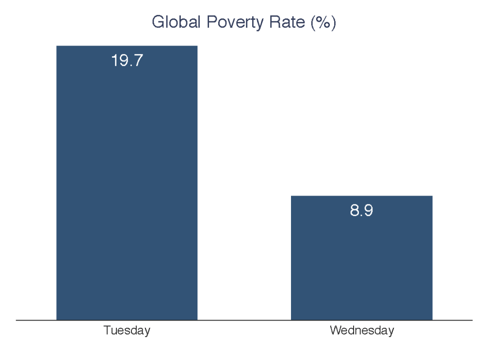
On Tuesday night, the International Comparison Project released the latest purchasing power parity numbers for the world’s economies. The vast majority of the planet slept right on as if nothing had happened.* And they were right. But the new numbers still suggest the size and distribution of world income looks considerably different than we previously thought. The World Bank will produce new official estimates in the coming days, but our preliminary estimates suggest the share of people in the developing world living below the absolute poverty line of $1.25 per day in 2010 “fell” by nearly half, from about 19.7 percent to 11.2 8.9, thanks to the revisions.
Poor countries are somewhat richer than we thought…
Global poverty numbers involve two sets of data: national income and consumption surveys (collated in the World Bank’s PovcalNet) and international data about prices around the world. The ICP is in charge of this second set of data. It compares what people buy and at what local currency price they buy those things to come up with a ‘purchasing power parity’ exchange rate, a ratio that is designed to equalize the power of a rupee to buy what Indians buy with the power of a dollar to buy what an American buys. Tuesday, the ICP released their estimates for what those purchasing power exchange rates looked like in 2011.
In short, the new PPP numbers suggest a lot of poor countries are richer than we thought. For example, The Economist now estimates that China’s economy will be bigger than the US economy by year’s end. (This much to the delight of Eclipse author and colleague Arvind Subramanian, whose forecasts now look better than anyone else’s.) But it isn’t just China. India’s 2011 current GDP PPP per capita from the World Bank World Development Indicators is $3,677. The new ICP number: $4,735. Bangladesh’s 2011 GDP PPP per capita according to the WDI is $1,733; the ICP suggests that number should be $2,800. Nigeria goes from $2,485 to $3,146.
…And a lot fewer people are living on less than $1.25 a day…
Related Research
We Just Ran Twenty-Three Million Queries of the World Bank's Website - Working Paper 362
The new purchasing power estimates also have an impact on the number of people under the international poverty line. If poor people in India can buy more with their rupee than we thought, that means they’re richer than we thought. We can use the poverty dataset Sarah and Justin recently scraped from PovcalNet to work out an estimate of how many fewer absolute poor people there are than we previously thought. We take the most recent PovcalNet survey data and looks at the number of people under $1.25 a day based on ICP2005 compared to ICP2011 numbers (in each case adjusted to the survey year using national CPI data).
To come up with a global 2010 estimate for the impact of the new ICP numbers on poverty, we use the approach that PovcalNet takes to ‘line up’ data based on national surveys done in different years — adjusting the income numbers by the change in private consumption per capita from national accounts data (more on the practice and pitfalls of this approach from Shaohua Chen and Martin Ravallion here). Note that a 2011 international dollar isn’t worth what it was in 2005. Allowing for US inflation, a 2005 $1.25 poverty line would be closer to $1.44 in 2011, so we set a ‘new’ international poverty line for 2011 US dollars of $1.44. The figure below (with a log scale) shows the ‘lined up’ data for countries — how much their estimated 2010 poverty (measured as $1.25 in 2005 dollars) increased or fell thanks to the ICP revisions.
The estimated number of $1.25 poor in India in 2010 falls from 396 393 million to 148 102 million, thanks to the revisions. The number of poor people in Nigeria goes from 88 87 to 60 51 million. And pretty much every country is sloping downward — using the same national survey data the new ICP numbers suggest much lower rates of absolute poverty.
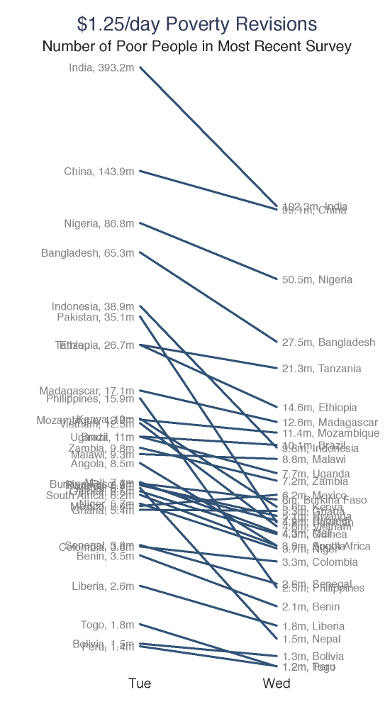
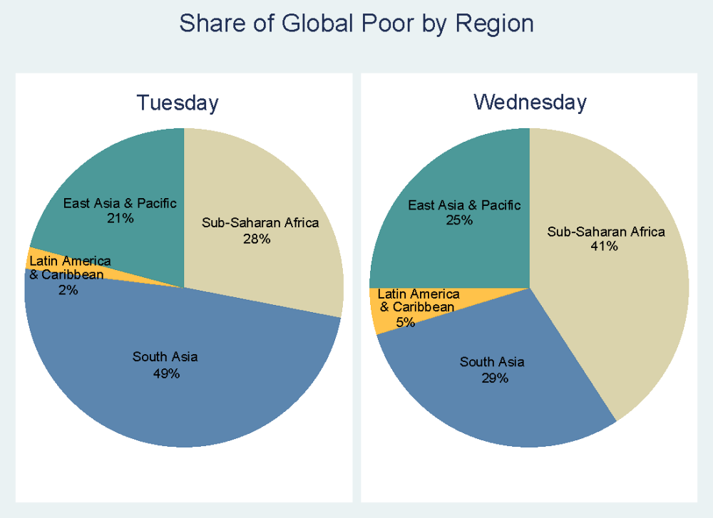
The new numbers also suggest that Africa is home to considerably more poor people than any other region — the pie chart below shows the old and new regional breakdowns. South Asia’s share of the world’s absolute poor was estimated at about 49 percent on Tuesday. By Wednesday morning it had declined to 34 29 percent.
…But Estimating Poverty Numbers is Hard.
It should be noted that the estimates of global poverty based on the 2005 ICP and PovcalNet data we produce are not the same as the 2010 numbers reported on the World Bank website, but they are close: when we match latest survey data country numbers for poverty using the 2005 ICP our estimate is 19.7 percent and the World Bank estimate is 20.6 percent. (Two reasons for the discrepancy: (i) we cannot follow the World Bank in estimating poverty for the DR Congo and Central African Republic because the WDI doesn’t have the national accounts data for us to do it and (ii) we use a more recent income survey for Nigeria.) The [corrected] Stata code and data we used for the calculation are available here. The originals are available here. We hope that people [re-]check — and extend on — our estimates.**
What lies behind the dramatic changes in calculated GDP and poverty rates? A big factor may be that the national inflation rates used to convert incomes into 2005 PPP dollars in the last few years appear to be higher than the rate of inflation reflected in the baskets of goods and services measured by the two rounds of ICP surveys: Pakistan’s PPP conversion rate for GDP was 19.1 Rupees to the dollar in 2005 and 24.4 in 2011 — a gentle increase of 28 percent. The Consumer Price Index in Pakistan has gone up 102 percent over that same period. That might reflect changing or inadequate ICP commodity baskets or consumption data in one or both years, or mismeasurement of prices by Pakistan’s statistical agencies. But whatever the reason, it appears to apply to a lot of countries. Very few places saw PPP conversion rates climb close to or more than CPIs between 2005 and 2011, which is why poverty rates based on the 2011 PPP numbers tend to be lower.
And that leads to a caution — any exercise in calculating global income and poverty numbers has to come larded with caveats. Angus Deaton’s big concern with purchasing power parity is that it isn’t very meaningful to say we are equalizing the power of a rupee to buy what (especially poor) Indians buy with the power of a dollar to buy what an American buys because (especially poor) Indians and Americans don’t buy very much at all of the same stuff. Poor people and rich people consume different things. There are also worries that countries (and China in particular) may be economical with the truth when reporting their survey data. And lining up data to measure poverty in a common year using private consumption per capita data from the national accounts is a highly imperfect approach.
Perhaps most importantly, it is worth repeating what didn’t change between Tuesday and Wednesday. The people who have just been classified as ‘not absolutely poor’ don’t actually have any more money than they did yesterday, and will still struggle in terms of getting a decent job, and many still face grim daily tradeoffs between buying school supplies or ensuring their kids are well nourished. In fact, if the new PPP numbers suggest anything it is that the quality of health or education or access to services associated with a given income has just gone down.
The new numbers are good news for people who care about poverty, but they matter much less for people who are poor.
*They were all sleeping if you adjust for geographic solar-facing parity.
**Don Sillers at USAID is producing a new Visual Basic tool to allow everyone to make their own poverty calculations — including the impact of PPP changes — more easily.
DETAILS OF CORRECTION: In the original version of this blog we presented numbers that missed out a year of CPI data (2011) in the calculation of the adjustments caused by the update. This error led to numbers that underestimated the potential impact of the revisions on the 2005 $1.25 PPP poverty. We also used 2011 population numbers rather than 2010 numbers. These errors were pointed out by Laurence Chandy of Brookings (who has his own post on the new PPPs and poverty), and we are very grateful to him. It is a sign of how many poor people are bunched near the 2005 $1.25 PPP line that missing one year of CPI data can have such a dramatic impact on the numbers.
We have egg on our faces. We're very sorry to those who quoted our original estimates and are contacting a number of them to notify them of the mistake and updated post. The experience certainly confirmed the benefit of CGD's policy to publish data and methods including Stata files wherever possible –for those who want to compare old with new, the original files for this post are here, and a list of changes by country here.
UPDATE: The post, comments here and the subsequent Brookings post have illustrated the potential range of adjustments to extreme poverty numbers ‘caused’ by the PPP revisions last week. If you use the approach we adopted above (one option that Angus Deaton proposed at the end of his AEA presidential address), poverty fell by about half. If you use 2005(ish) national poverty lines updated for the new PPPs (another option that Angus Deaton proposed in his AEA presidential address, and the ‘minimal requirement’ proposed by Martin in the comments below) poverty fell by around a fifth (this is close to the Table 1C result from the Brookings blog). If you use Michael Lipton's FEM approach (see comments for details) or any other approach that doesn't involve the PPP conversion at all, by construction estimates of poverty wouldn’t have moved at all.
When it comes to the new official World Bank numbers, we’d certainly prefer an approach that (at the least) adjusts for the actual purchasing power of poor people (see Kaushik Basu on this point here). But going forward, if the World Bank extreme poverty numbers are going to be compatible with the World Bank’s mission of ending extreme poverty, we suspect the Bank’s approach to extreme poverty calculations is going to have to change. Previously, that approach included updating to the latest poverty lines of the world’s poorest countries. But it is implausible to imagine the poorest countries in the world in 2030, however fast they grow between now and then, would declare they had no poor people. That would be required if the world were to meet a global zero extreme poverty goal based on the average of the poorest countries’ 2030 poverty lines.
So it is a good time to have a discussion of how much change we want in how the poverty numbers are calculated, and if we can stick to that approach going forward to 2030. The World Bank has set a zero poverty goal, now it needs to fix the goalposts. (And it should be transparent with the data and methodology so everyone can know how close to the goal the world is.) We hope, despite the calculation errors and the heat and light, this post and the comments below have contributed to that debate.
All data used in this post can be found here (insert link to dta file attached). Raw data available here.
All Stata programs can be downloaded here.
Disclaimer
CGD blog posts reflect the views of the authors, drawing on prior research and experience in their areas of expertise. CGD is a nonpartisan, independent organization and does not take institutional positions.