Given the microfinance crises in various countries in the last few years, I've been wondering which place might be next. Partly inspired by the format of Daniel Rozas's analysis of Andhra Pradesh a couple of years ago, I made scatter plots of some indicators of potential danger, such as number of microloans outstanding per adult (someone 15--64 years old) and the rate of growth in number of loans. I was curious whether crisis countries could be characterized statistically, and which seemingly tranquil countries they resembled.To various indicators on the level and growth of lending, I added one on the financing structure of MFIs: the share of assets funded by deposits as opposed to borrowings from foreign investors or equity (complete spreadsheet). (See table 7 of chapter 8.) One big limitation of this exercise is that the nation may be the wrong unit of analysis. India's difficulties have mostly been in Andhra Pradesh; Pakistan's in Punjab; and Bosnia and Herzegovina's in Tuzla. National averages can obscure local and regional developments.Having data on Andhra Pradesh at my fingertips, I added it. Note that national figures are for 2008 or (for growth rates) annualized over 2004-08. The AP numbers are for 2010 or 2009--10.I should say that I arrived at the three indicators graphed below partly through data mining. They seemed to best distinguish the crisis countries from the non-crisis ones (both visually, and in statistical significance tests in a probit regression, if you know what that is). So there is a just-so quality to this analysis. Time will tell if it is merely a retroactive rationalization of history or the basis of a model with predictive value.The "Loan growth vs. loans/adult" graph (second tab) puts most of the crisis places along the northeast frontier---high numbers of loans and/or high growth. However, it is worth noting given all my emphasis on the problem of fast growth, that while these places were not the fastest expanders. Also interesting is that countries with mature markets are next to ones that got in trouble. Does Nicargua's proximity to Bolivia and Peru mean the latter are about to go down the tubes too?Maybe not. If you look at the other graph (first tab), you'll see how factoring in deposit-taking changes the picture. Aside from Nigeria, all the crisis places had very low deposit ratios. Their growth was primarily financed by outside investors (including domestic banks in India and Morocco), and that growth proved brittle. Interestingly in the bottom right of this graph, Armenia shows up alongside the unfortunate Bosnia and Herzegovina, Nicaragua, and Andhra Pradesh. Put Armenia on your watch list.
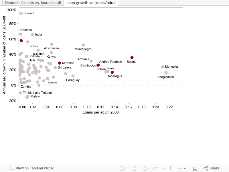 Note: National-level data from the MIX Market.
Disclaimer
CGD blog posts reflect the views of the authors, drawing on prior research and experience in their areas of expertise. CGD is a nonpartisan, independent organization and does not take institutional positions.