The World Bank recently released a "global scorecard for policymakers" called the Regulatory Indicators for Sustainable Energy (RISE)—not to be confused with education RISE, civil rights RISE, robot RiSE, church RISE, pesticide RISE, television RISE, fashionwear RISE, or Katy Perry RISE.
Clocking in at 264 pages, this particular RISE report scores the national policy and regulatory frameworks for sustainable energy in 111 countries across 27 indicators spanning three categories: energy access, energy efficiency, and renewable energy. More data and cross-country comparator benchmarks are useful, so the report and its public database are very welcome contributions. For an overview, check out the 2-pagers on energy Access, Efficiency, Renewables, and Africa.
A few of our takeaways from an initial read of the energy access section:
-
No surprise: Africa lags. Across all but one of the seven dimensions that the report uses to measure access, Africa is the lowest scoring region. For example, almost 40 percent of African countries do not have official electrification plans. Paired with the fact that Africa has the largest electricity access deficit, and is far behind in generation capacity to meet demand, it is further evidence that we must keep the momentum going on Power Africa, or other energy access initiatives.
-
“Subsistence consumption” is a better phrase for minimal electricity than “modern energy.” The report uses 30 kWh per month per household as the minimum monthly consumption level for the affordability analysis. This works out to just 1 kWh per household per day or 72 kWh per person per year—which is barely any electricity at all. The average American uses 13,000 kWh per year. But at least calling this “subsistence consumption” is more appropriate than the current IEA standard which defines “modern energy access” as 100 kWh for urbanites and just 50 kWh for rural citizens. (In More Than a Lightbulb, CGD proposed labelling the 100 kWh threshold as the “extreme energy poverty line.”)
-
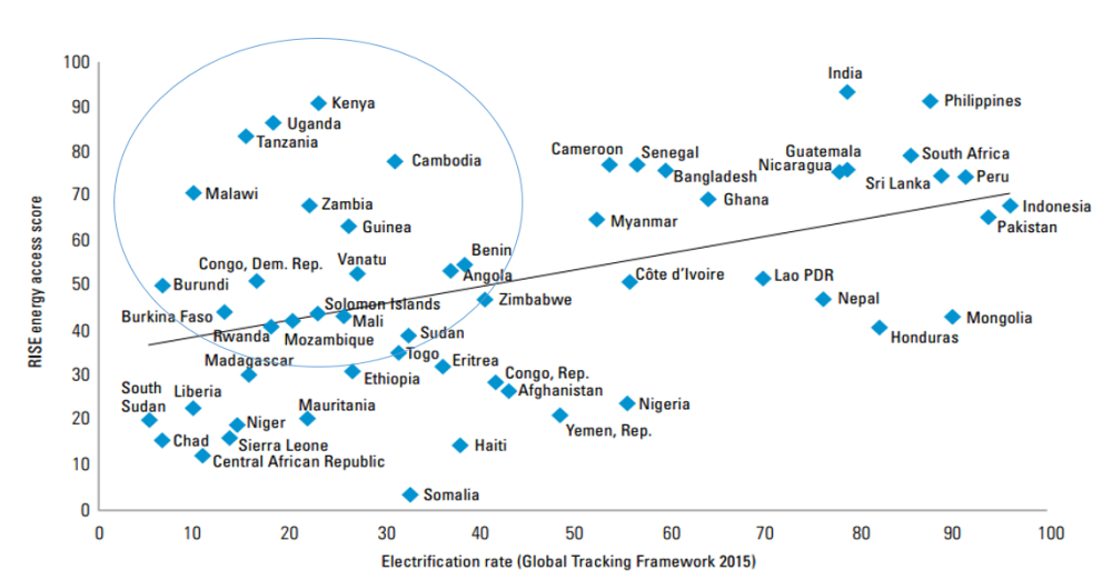
Expect rapid progress from Kenya, Uganda, Tanzania, Cameroon and Senegal... The graphic below (from the report) compares RISE access scores with actual electrification rates from SE4ALL’s Global Tracking Framework. In the circle are countries with good scores but poor results so far. If the RISE scoring has any meaning at all, this should be the group of future high-performers. We blogged recently about Kenya’s impressive connections, where the access rate jumped from 27 percent to 55 percent in just three years, in part due to policies targeting connections for under-the-grid households.
Figure 1: Association between RISE energy access score and electrification rate
Source: World Bank
-
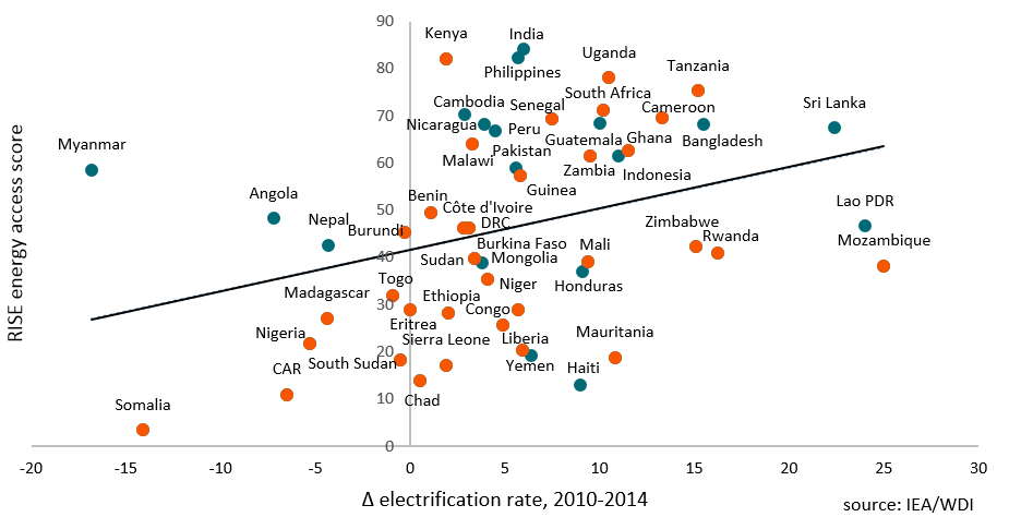
… Or maybe not? What, really, do these scores tell us? The report claims a "strong association" between a country’s RISE access score and its electrification rate. But look again at the graphic above and this seems a bit generous. The R^2 is just 0.20. Ideally, we’d like to see if a good score predicts future results. For instance, does a high score predict a faster-than-average change in electrification? Since the RISE scores are only available for today, we won’t know for sure until 2020 or beyond. Is Kenya the anomaly or is the RISE scoring capturing a wider phenomenon? The best we can do today is compare the most recent RISE score with the most recent actual results. If RISE is robust, we’d logically expect countries with strong ratings to be those also making the fastest progress. Below is our own graphic showing RISE energy access score versus the change in electrification rates between 2010-14. The R^2 drops to just 0.11. (Hmmm. CPIA endogeneity redux?)
Figure 2: Association between RISE energy access score and change in electrification rate (2010-2014)
Overall, we welcome the enhanced data on energy and its many dimensions. Whether RISE changes the way we think about access and ultimately helps to identify the steps to close the gaps even faster, we’ll have to wait to see.


