Satellite data suggests poverty is falling faster than we thought, but it’s probably not reliable enough to trust for targeting social programs – at least not yet.
Recently, a journalist asked me to comment for a story on a new paper to be published in Science that applies machine learning to satellite images from Google to create cheap, rough-and-ready poverty measures for several African countries. Sounded cool. Even better: they trained their algorithm on a poverty survey in Tanzania that I helped design and launch as my first job out of grad school. I think that pretty much makes me an astronaut.
The new paper by Neal Jean, Marshall Burke, Michael Xie, Matthew Davis, David Lobell, and Stefano Ermon at Stanford adds to a burgeoning literature that uses NASA’s “night lights” data to measure economic activity. Previous work has shown that NASA’s images of lights visible from space may outperform traditional GDP metrics as a measure of economic growth in poor countries, and may even suggest global poverty is falling even faster than we thought.
The problem with NASA’s night lights is that rural areas of very poor countries like Tanzania are just blank. There’s no light detectable from space whatsoever, so no ability to measure variation in poverty across space or changes over time.
What the Stanford team has shown is that daylight beats night lights. In short, they show how to extract information from daytime satellite images that provides a more accurate prediction of poverty than the night lights. This is a cool technique that I’m sure will (and should) get a lot of use among researchers, and will hopefully catalyze further refinements to the approach.
Figure 1. An example of the daytime satellite images and features extracted from urban areas, non-urban areas, water, and roads (left to right)
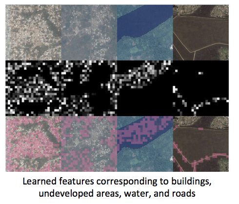
Source: Screenshot from Jean et al (2016)
Unfortunately, beating the night lights data is still a pretty low bar since night lights can’t perceive any variation between the poorest villages and the richest villages in rural parts of much of the developing world.
New technology, old worries
For years, the World Bank has used a related technique to provide countries with “poverty maps” that cover localized areas beyond the reach of traditional surveys. The older World Bank technique uses population census data in lieu of Google satellite images to fill in areas where surveys are missing. But the conceptual challenges are similar, and non-trivial.
When the World Bank asked academic luminaries Abhijeet Banerjee, Angus Deaton, Nora Lustig, and Ken Rogoff to evaluate the Bank’s whole research portfolio back in 2005, they singled out poverty mapping for criticism (p. 61).
“The difficult and contentious issue with this work is the accuracy of these estimates, and indeed whether they are accurate enough to be useful at all. Ideally, the users of the maps, policymakers and statistical offices in the countries that use them, should be able to judge whether the maps are accurate enough for their purposes, some of which, like the allocation of poverty-relief funds, are extremely politically sensitive.
…
“What we are most concerned about is the possibility that the Bank is making very attractive poverty maps, whose precision is not known, but which come with statements of precision that we suspect may be seriously misleading.”
For balance, see the World Bank research department’s response here. But in any case, it’s worth asking if this old worry applies to the new satellite-based poverty maps as well.
The satellite data is probably good enough for academic purposes…
Why do we measure poverty in the first place? The Science paper lists two pretty good reasons: (i) to study the determinants of poverty, and (ii) to target social programs. My reading of the data is that satellite imagery is likely to be very useful for the first purpose, and not at all useful for the second purpose given its current accuracy at predicting poverty.
Here’s the scatter plot of actual household consumption (which is the basis for poverty measurement in most of Sub-Saharan Africa) with the satellite-based predictions on the vertical axis:
Figure 2. Predicted vs actual cluster-level assets.
(NB: The paper and the text use consumption as well as assets, but for copyright reasons we’re reproducing only images which appear in an earlier Stanford poster version. See Figure 3 in the Science paper.)
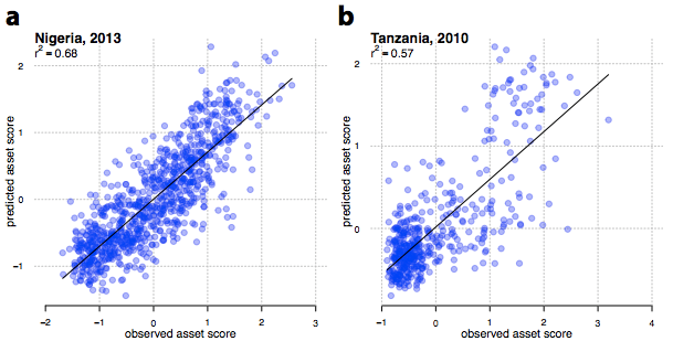
Source: Screenshot from Jean et al (2016)
The Stanford team evaluates the success of their predictions based on the R-squared of these linear relationships. That’s probably quite relevant for researchers who want to use this data as a proxy for economic development. At the high end, they can explain 55 percent of the consumption variation in Tanzania, and at the low end, only 37 percent of the variation in Malawi. That sounds pretty good, but it’s probably too rosy a picture. For one, since part of the motivation for the method is to estimate poverty where surveys aren’t available, they report the R-squared when training the algorithm on one country and applying to another. When you take the Tanzania estimates to Uganda, R-squared falls to 0.38. When you train the algorithm in Malawi and apply it to Nigeria though, the R-squared falls to 0.19.
Furthermore, when the authors (reasonably, and very transparently) restrict themselves to the poorer parts of the distribution near the global poverty line, the R-squared for all countries combined falls down to about 0.1. That’s… not great. It turns out that daylight, like nightlights, are much better at predicting high levels of consumption than low levels.
…but probably not accurate enough for policy purposes
Imagine now that the Tanzanian government wants to use this data to target a social program. Poverty is a binary outcome, so rather than R-squared, it’s useful to think of this in terms of misclassification rates. As a crude estimate, I took the Tanzanian survey data the Science paper used, and added some white noise to create a consumption proxy with different levels of R-squared. With an R-squared of 0.55 as the Stanford team found in Tanzania, I estimate the government would get a cluster’s poverty status right about 75 percent of the time. (Note that we don’t know if this would work at the household level yet, as surveys don’t release household GPS data.) If the R-squared falls down to the levels the authors report near the poverty line though, it’s more like a 60 percent accuracy rate.
(Stata do-file here. As an aside, I suspect Jean et al have made a fairly innocuous mistake in the PPP conversions, underestimating poverty in Tanzania; the $1.90 poverty rate in Tanzania in 2012 according to Povcalnet is 46.6 percent; I count 39 clusters with average consumption below $1.90 in the NPS data, which looks like a lot more than the number of blue dots west of the red line in the scatter plot in Figure 3 of the Science paper.)
Anyway, if my calculations are even roughly right, the satellite-based poverty measure is a little more accurate than a coin toss, but not a lot. I imagine I’d be pretty upset if the IRS only delivered my tax refund 60-75 percent of the time, or my health insurance plan only processed 60-75 percent of my claims. Again, this kind of error is fine for lots of research purposes. But contrary to popular belief, policy applications often require much greater rigor than required for publishing in academic journals.
Topics
DISCLAIMER & PERMISSIONS
CGD's publications reflect the views of the authors, drawing on prior research and experience in their areas of expertise. CGD is a nonpartisan, independent organization and does not take institutional positions. You may use and disseminate CGD's publications under these conditions.