This Wonkcast was originally recorded on September 2, 2014.
As the Ebola epidemic continued to spread in West Africa, with more than 3,000 cases and 1,500 deaths, I invited CGD senior fellow Mead Over, a health economist and one of the world’s top experts on the economics of HIV/AIDS, to discuss newly released maps from the World Health Organization (WHO) and measures for limiting the economic fallout from the epidemic.
“Ebola is much more like Avian Flu and SARS than AIDS,” Mead tells me. “Its gestation period is very rapid, and that stirs a panic that creates an economic impact.”
In the case of the SARS epidemic, he notes, there were only about 800 deaths but the economic impact of reduced trade, tourism and investment was estimated at about $40 billion—the equivalent of $50 million per death.
In the case of the Ebola epidemic, where cases will far exceed those of SARS, the economic impact could be far greater, he says.
He emphasizes however that the Ebola epidemic so far is tiny compared to the toll of malaria, tuberculosis, and HIV, “all of which are many multiples more deadly on a continuing basis.”
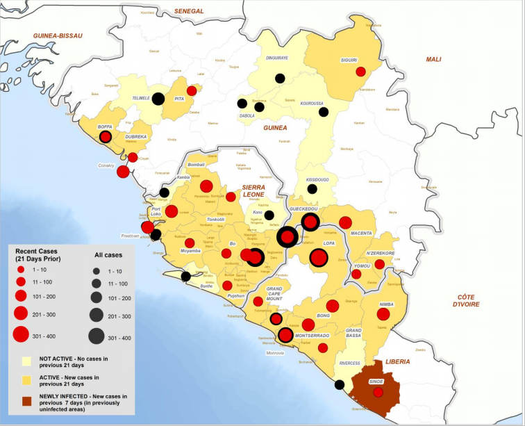
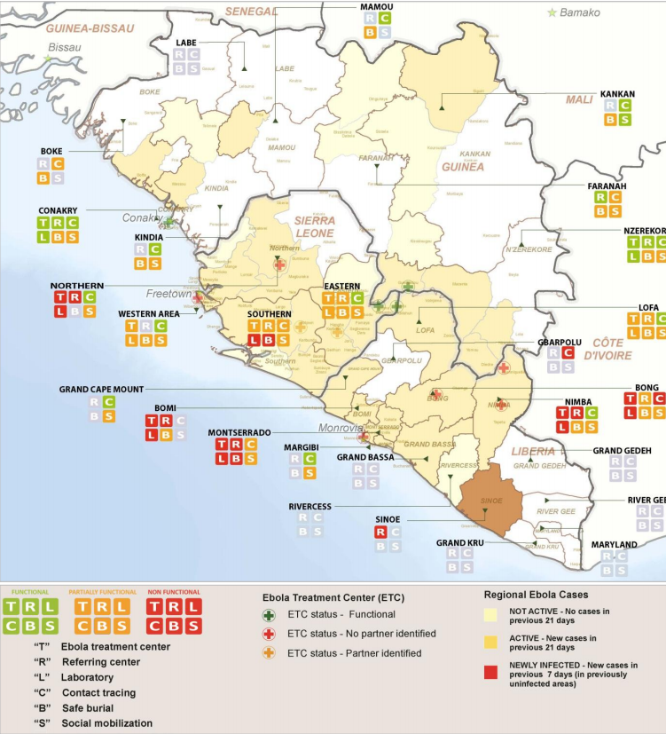
Our conversation then turns to two maps that the WHO released late last week, one showing the location and spread of the Ebola virus (Figure 1), the other showing the location of laboratories and treatment centers (Figure 2).
Figure 1: Location of cases throughout the countries with most intense transmission
Figure 2: Response Monitoring
“These maps are very helpful to those of us who are trying to grasp what’s happening in real time in West Africa. What they show is that we have a long way to go,” Mead says.
He adds that it is “shocking” how few laboratories able to confirm the diagnosis are shown in the map. While there may be some additional laboratories that are not shown, the WHO maps are presumably the best information available, so either the data or the labs themselves are alarmingly lacking.
“Labs are necessary to confirm a diagnosis of Ebola. The inability to confirm a diagnosis makes it much harder for the physicians and nurses to protect themselves. It means there's a need to quarantine people who would not otherwise need to be quarantined. And quarantining is extremely difficult,” he explains.
Released along with the two maps last week was WHO’s “Ebola Response Roadmap” which outlined steps for affected countries and the international community to contain the epidemic.
WHO projects that if all recommended measures are taken the epidemic may be contained within 6-9 months with perhaps more than 20,000 cases.
Noting that most of the cases shown on the WHO map are recent, Mead says that the toll may be much higher.
“That’s an indication that this epidemic is growing very rapidly in the countries of Liberia, Sierra Leone, and Guinea. The reported cases do not seem to be close to the border of Senegal or Guinea-Bissau, but there are cases close to the borders of Mali and Cote d’Ivoire,” he says.
So while this epidemic has been confined primarily to three countries, the governments of Cote d’Ivoire, Mali, and Guinea-Bissau are all on the alert.
“There’s a need for all those countries to strengthen their health infrastructure at the borders,” Mead says.
Mead concludes by discussing the international community’s response to minimize the economic fallout, an issue he addresses in greater detail here.
My thanks to Aaron King for a first draft of this blog post and to Kristina Wilson for recording and editing the Wonkcast.


