Recommended
Blog Post
The Case for New Countries to Contribute
Blog Post
POLICY PAPER
China as a Provider of International Climate Finance
Discussions on climate change and development typically rely on three stylized facts—developing countries are most hurt by climate change; developed countries are most responsible historically; but developing countries are now the biggest emitters. This narrative is central to UNFCCC climate negotiations on reducing emissions and raising climate finance. And it increasingly shapes the efforts and focus of development institutions, such as the World Bank’s bold new vision “to create a world free of poverty on a liveable planet.”
Here, we revisit three key questions, considering the most recent evidence: Which countries are most affected by climate change? Which countries have emitted the most greenhouse gases historically? And which countries are the biggest emitters today?
On those most hurt by climate change, our analysis shows that income losses in low-income countries which can be attributed to climate impacts are about five times larger than those in high-income countries. Regarding emissions, we show that while developed countries have indeed produced most CO2 emissions since 1850, “developing” countries are now responsible for the majority of all greenhouse gases emitted since then, and are responsible for most of today’s emissions however measured. But this hides very wide variation between developing countries: the share of emissions from low-income countries remains tiny. We argue, at least in the context of climate negotiations, that a binary distinction between developed and developing countries is no longer helpful.
Developed and developing countries: Some basic data
We define developed countries as “high-income countries” (HIC) using the World Bank’s categorisation, with developing countries comprising all upper-middle (UMIC), lower-middle (LMIC) and low-income countries (LIC) .
Per capita incomes in developed countries are four times the global average, nine times those of developing countries overall, and over 70 times those of the poorest (low-income) countries. Developed countries account for 63 percent of global income and 16 percent of global population. Their per capita greenhouse gas (GHG) emissions are more than twice those of developing countries, and over four times higher than the poorest countries, more according to some estimates (details in Table 1). These inequalities drive much of the current debate around climate and development.
Table 1. Developed and developing countries: Key summary statistics
| Per capita income band | Average per capita income 2022 (US$/hd) | Total Income 2022 (%) | Total Population 2022 (%) | Per capita GHG emissions 2022 (t CO2e/hd) |
|---|---|---|---|---|
| Developed (High Income) Countries (over $13,845/hd) | 51,776 | 62.5% | 15.6% | 12.4 |
| Developing Countries | 5,772 | 37.5% | 84.4% | 5.8 |
| - Upper middle income ($4,466 – $13,845/hd) | 10,608 | 29.1% | 35.6% | 9.4 |
| - Lower middle income ($1,136 – $4,465/hd) | 2,539 | 8.0% | 41.0% | 3.2 |
| - Low income (less than $1,136/hd) | 727 | 0.4% | 7.8% | 2.9 |
| World | 12,968 | 100.0% | 100.0% | 6.8 |
Sources: World Development Indicators (incomes and population) and Our World in Data (GHG emissions).
Notes: This table uses WB income thresholds and classifications for the 2023/24 year which draw on 2022 income data. We use OWID data for GHG emissions (from which GHG/hd are derived) because more recent 2022 data are available [WB WDI GHG/hd figures are generally lower (especially for LICs), in part because they exclude emissions from land use change: their (2020) figures show GHG/hd in HICs are more than eight times higher than in LICs; both sources show even more extreme differences when just looking at CO2 emissions]. Minor differences with reported WDI/OWID figures for each income category are because we have recalculated figures from individual country data to ensure consistent country coverage for all columns based on income classifications in 2023/24, and to combine LIC, LMIC and UMIC data into a ‘developing country’ group.
Which countries are hardest hit by climate change?
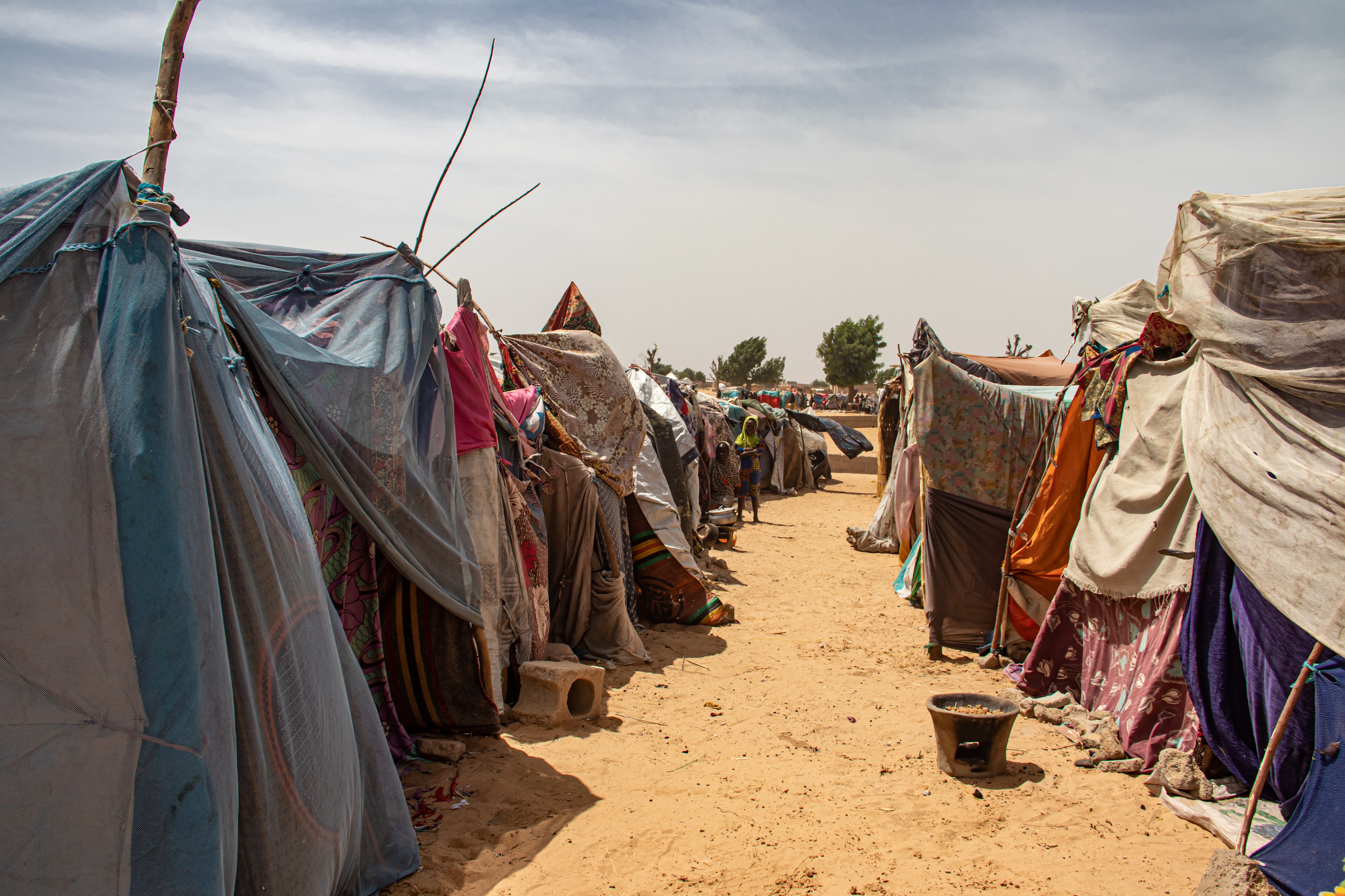
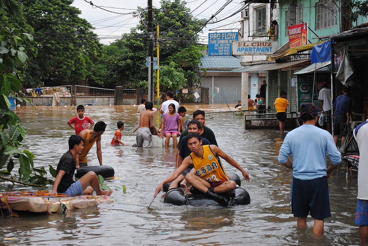
While estimates of the economic costs of climate change remain heavily contested, all the evidence points to developing countries being hardest hit by the impacts of climate change: they are already hotter, more exposed to extreme weather events, more vulnerable to adverse impacts on health and agriculture, less resilient due to weaker infrastructure and institutions, and face larger reductions in future growth and incomes.
One recent paper reviews a large number of studies that seek to quantify the economic or welfare impacts of climate change. These are used to estimate the effects of 2.5oC of global warming on the incomes of people in 198 countries, which we have grouped into the four income categories (Chart 1). This confirms that poorer countries are worst affected. Average welfare losses in LICs are about five times larger than in developed countries. These estimates are typically based on fairly narrow measures of income (many omit impacts on health or nature) and may well be underestimates (the IPCC’s review shows even larger global impacts overall).
Chart 1. Impacts of climate change
Climate impacts are causing poorer countries much larger losses than richer countries

Source: Tol (2024); estimates (extracted from this data file) are unweighted averages of countries within each income group. Figures are ‘welfare-equivalent income changes’ and show how much worse off people would feel as a result of 2.5 degrees of global warming.
Which countries have emitted the most greenhouse gases?
Developed countries (HICs) account for the largest share (43 percent) of the cumulative greenhouse gas emissions (GHGs) since 1850 that have caused climate change, with UMICs accounting for 37 percent, LMICs 16 percent, and LICs just 3 percent(Chart 2). The US has been the largest individual GHG emitter since 1850 (18.2 percent), ahead of China (12.1 percent), Russia (6.8 percent), India (4.9 percent), and Brazil (4.5 percent).
We focus on all GHG emissions because that is what matters for climate change, and because that is the metric used when countries set out their emissions reductions targets in their Nationally Determined Contributions (NDCs). Contrary to widespread perception, you have to go back to the 1960s to find a year when cumulative GHG emissions from (today’s) high-income countries exceeded 50 percent, although it’s worth noting that different sources of GHG data do differ somewhat.
Comparable figures for the share of cumulative CO2 emissions (from fossils fuels and industry, excluding land use change) for HICs, UMICs, LMICs and LICs are 56, 31, 9, and 1 percent respectively (totals do not quite sum to 100% due to omission of international shipping).
Interestingly, the cumulative share of GHG emissions since 1850 of the 23 high-income countries that have a formal responsibility to provide climate finance is just 37 percent (49 percent if CO2 only).
Chart 2. Who caused climate change historically?
High-income countries are responsible for the largest share (43 percent) of GHG emissions 1850-2022, with UMICs 37 percent, LMICs 16 percent, and LICs just 3 percent

Which countries are emitting the most greenhouse gases today?
However, the pattern of emissions is changing rapidly. Chart 3 replicates the chart above but just for 2022. Developed countries now account for just 29 percent of GHG emissions, with UMICs accounting for 48 percent, LMICs 19 percent and LICs less than 4 percent (shares of CO2 emissions are 34, 47, 15 and less than 1 percent respectively). This reflects the huge economic progress made by many middle-income countries in the last 30 years.
China is now by far the largest individual GHG emitter (25.9 percent), ahead of the USA (11.1 percent), India (7.5 percent), Russia (4.3 percent), and Brazil (4.2 percent). The combined share of GHG emissions from all LICs/LMICs/SIDS/LDCs in 2022 was 23 percent (and 16 percent if CO2 only), most of this from LMICs.
Chart 3. Who’s causing climate change today?
High-income countries are responsible for just 29 percent of GHG emissions in 2022, with UMICs the largest contributor at 48 percent, LMICs 19 percent, and LICs less than 4 percent

Conclusions
Development progress in the last 30 years has been extraordinary: the number of HICs has increased from 36 to 71, the number of UMICs from 33 to 54, and poverty is increasingly concentrated in a diminishing number of LICs and LMICs. The change in scale and composition of emissions has also been extraordinary: GHG emissions in the 30 years since 1992 account for 42 percent of all emissions since 1850 (the comparable CO2 figure is 52 percent), with nearly two-thirds coming from today’s developing countries.
Even going back to 1850, today’s developed countries now account for much less than half of cumulative GHG emissions. The economic success of many developing countries that has delivered massive reductions in poverty and huge improvements in so many development indicators is to be celebrated. But all countries will be damaged by climate change. In the context of climate negotiations, including discussions about climate finance, old distinctions between developed and developing countries are no longer helpful.
Note: This blog updates an earlier (2015) CGD blog by Jonah Busch, Climate Change and Development in Three Charts. In that blog, developed countries referred to all countries in Europe, the former Soviet Union (including much of central Asia), the United States and Canada, Australia and New Zealand, and Japan, while developing countries referred to all other countries. It suggested that developed countries were responsible for a much higher 79 percent of historical emissions since 1850, but that is because it counted a larger and more polluting set of countries as “developed”, only counted emissions to 2011, and only covered CO2 rather than all GHG emissions.
With thanks to Ian Mitchell for helpful comments.
Topics
DISCLAIMER & PERMISSIONS
CGD's publications reflect the views of the authors, drawing on prior research and experience in their areas of expertise. CGD is a nonpartisan, independent organization and does not take institutional positions. You may use and disseminate CGD's publications under these conditions.
Thumbnail image by: Melinda Nagy/Adobe Stock